case study
food truck customization app
Timeline
4 Weeks
Services
Product Design
TOOLS
FIGMA, MIRO, ADOBE CREATIVE SUITE, GOOGLE SLIDES, MURAL
Brand
Services
To start, food trucks are awesome - and for many cities across the world, one of the most fun and convenient way to access good and new foods. However, many food trucks face the challenge of convenient and efficient ordering. A quick breakdown - with research, not many food trucks have or even utilize and online/mobile ordering system.
The goal is to provide a valuable solution in the form of a customized ordering app. for food trucks to enhance user experience by streamlining the ordering process. for customers/users to place orders. With intentional features, this will help support saving time and reducing errors.
The solution will not only simplify menu browsing and order placement but also offer features like group ordering, and and option to favorite items. In addition, the customized experience will ordering allows the customer to truly order something meant for them, where they can pick-up at a scheduled time. By integrating location-based services and real-time updates, this should provide a seamless and engaging experience that connects food truck vendors with their customers efficiently and effectively.
Discover & EMPATHIZE
UNDERSTANDING THE USER
Methodologies:
Competitive Research
User Interview
COMPETITIVE ANALYSIS
During the research process, I initially reviewed over 10 competitors, and narrowed it down to five, to thoroughly examine. By analyzing these competitors I was able to see what others have done, are doing, what’s successful, and what’s not by industry standards and market trends.


WHAT DID I UNCOVER?
The research process helped me to understand just how important this application is needed. Each business had a great unique value proposition, but would that be strong enough to carry challenges with user experience? The most interesting thing I discovered was the lack or non-use of an app. out of the five businesses, only one (Taco Republic) had a corresponding app for ordering. I think something to note about this discovery is the fact that most of these food trucks are still considered small businesses, which may support the reason for not investing in an app.
While most didn't have a customized ordering app, online ordering was still available, and at two ( Taco Republic & Taco Benditos) provided an option to create a customer account. Overall, the main competitor would be Taco Republic.
USER INTERVIEWS
I intereviewed six individuals from a variety of backgrounds (gender, sexuality, religion, age, profession, disability, etc.) to provide insight on their previous and/or current experiences with mobile applications. I was able to uncover pain points and receive feedback on improvements or suggestions they would like to see in an app.
What was most important to all individuals was time, visual communication, and the ordering process and notifications. In addition, I was able to form personas from these interviews to help represent the user and the needs for the design process.

TIME
Users are busy with their family life, professions, and school to cook

VISUALS
Descriptions, but lack of images to preview items

ORDERING
Not having a seamless and quick way to order or modify selections

STATUS & PROGRESS
Estimated pick-up or "ready" times not available
DEFINE
PERSONAS

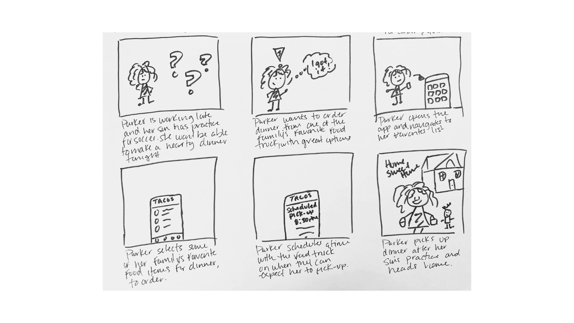
MEET PARKER:
Parker is an entrepreneur, running her own holistic health storefront. She has an unorthodox schedule. No two days are alike and hours vary depending on clients, business operations, etc. She’s married with one child (age 12). Her husband is an optometrist. Both wear glasses. With a child that is active with extracurricular activities, and varying schedules, they often get take out around 3-4 times a week for dinner. She is adamant about healthy food choices, yet easy ordering. She loves technology and enjoys ordering through apps that are seamless, efficient, and easy to read.
GOALS:
Always make time for family
Looking to grow her company to hire more staff, and open a second store
Have healthy food options that aren't time consuming
FRUSTRATIONS:
"Good, healthy, and quick food is sometimes hard to find. It seems like all the healthy foods are made to be the same. Where's the diversity?
"Sometimes I am pressed for time, an when I order ahead, my order still isn't ready."
"I am a visual person. I like to see what I am getting. Sometimes there aren't images of food, when I'm ordering."

MEET ALEX:
Alex is an undergrad student and aspiring architect. He has a part-time job at a construction company, working in the architectural department as an assistant. He’s eager to learn and prides himself on being a team-player and being vocal about his ideas and things he’s learned. His boss is supportive of his growth. He enjoys all kinds of foods and likes trying new things. His friends, family, and even co-workers trust his food decisions and always ask for suggestions. Within the next year, after graduation, he hopes to move up from assistant to Jr. Architect at the current company he works for.
GOALS:
To be intentional throughout my career journey
Carve out some "me time", whether it is 30mins to an hour
Travel more
FRUSTRATIONS:
"Between school and work, sometimes I don't have much time to eat."
"Sometimes when ordering online through an app, modificaitons are limited. So, I spend time picking things off of my food before eating."
STORYBOARDING


IDEATION
TASK & USER FLOWS
I broke down the task and user flows into three different parts. The first flow would be the standard ordering process for a user with an account. With an account, the process with be representative of the ease and quickness of ordering by selecting items that have been favorited. The second would be a user looking for a customized experience by creating an account and placing an order with the ability of favoriting items. The final task would be a journey of creating a group order.
Task 1: Users just want to Order

Task 2: Customized Just for You

Task 3: The More the Merrier (Groups)

DESIGN
Sketch Wireframing - what's possible?
Sketching was a fun, yet strategic aspect during this case study. I was able to get ideas from my head onto paper no matter how big or small. This helped me to pull elements from each sketch and get things more solidified for wireframes.

Lo-mid fi wireframing

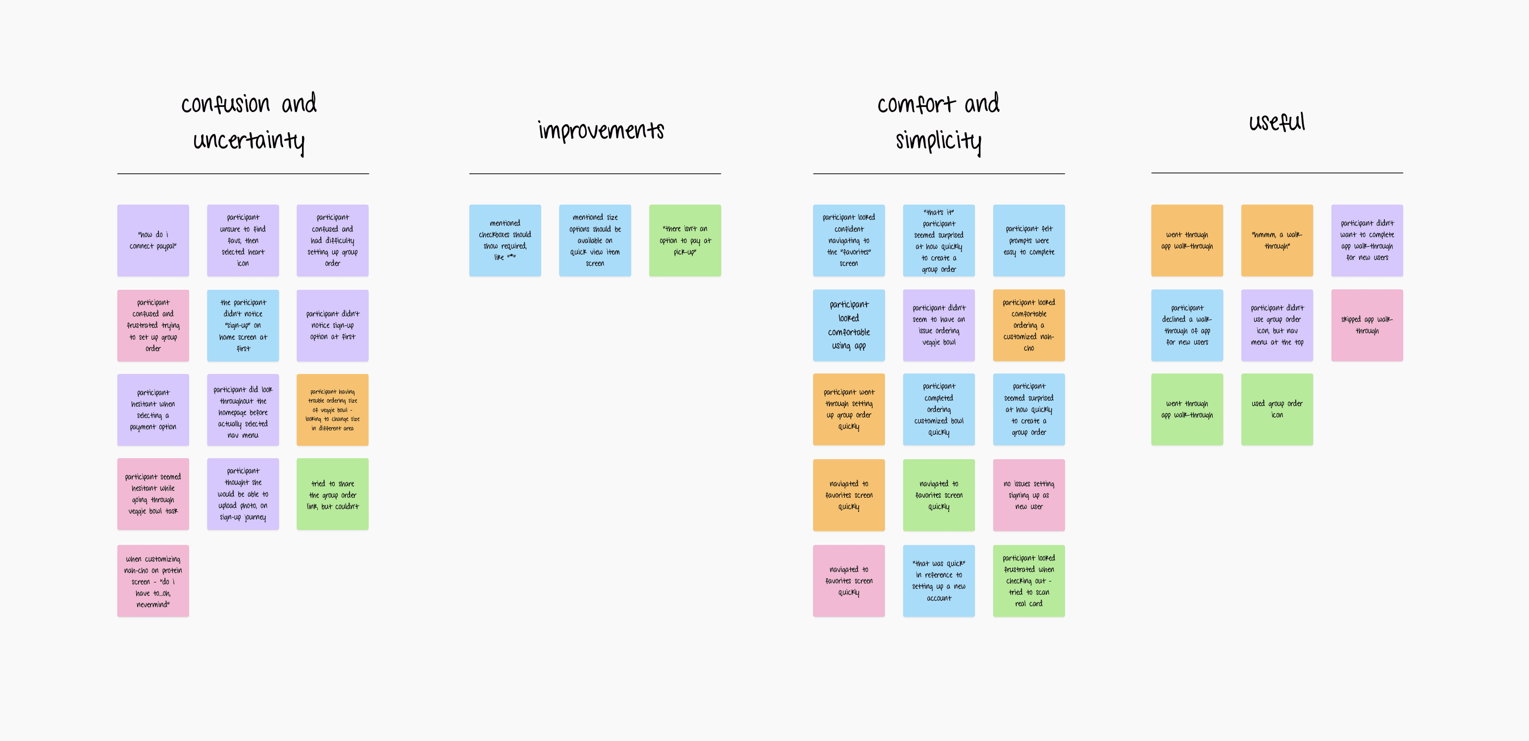
user testing: WHAT CAN BE IMPROVED?
After I did user testing with the lo/mid-fi wireframes, I received so great feedback to help improve the final design. A few things that stood out:
Users didn't notice certain features/actions like sign up or continue as guest, on login page.
Most users declined a "walk-through" option of the app to understand how to utilize.
Most users were confused on group ordering. They weren't used to that feature and didn't recognize the icon.
Most users were familiar with "favoriting" an item.
Users were a little confused on customizing an item for ordering.

don't be good, be great!
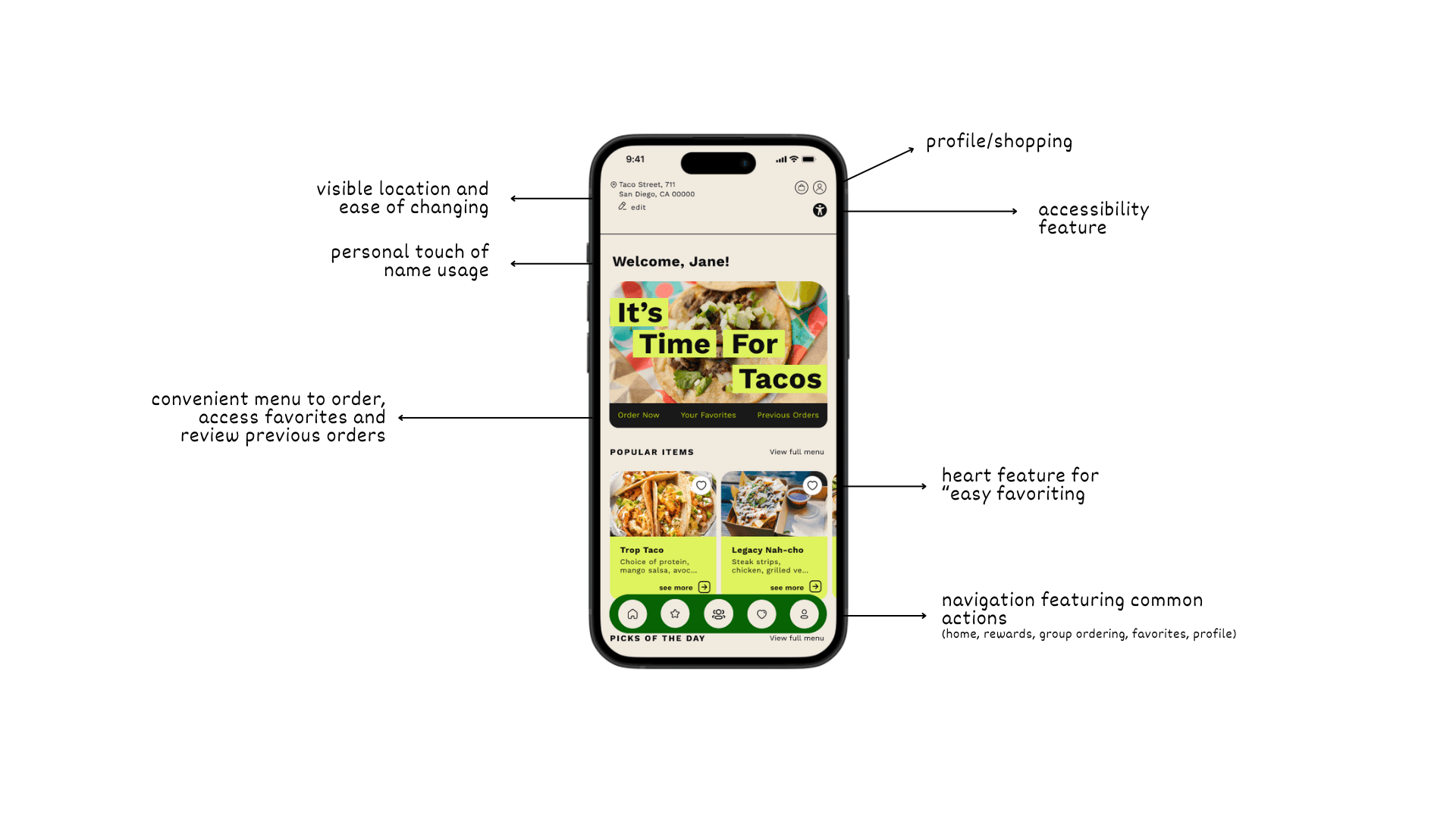
After going through user feedback and implementing suggestions and making more user-friendly, I was able to officially create a product that is functional, useful, and simple to use.

SIGN-UP
Sign-up flow starts at the login screen that is traditional and/or familiar to most sign-up screens for app.
Highlights:
Option to hide or show password
Option to remember device
Option to "sign-up" or "continue as guest" under submit button to make more visible
USERNAME & PASSWORD RECOVERY
The recovery flow is useful because people sometimes forget one or the other, or both.
Highlights:
Option to recover through email or phone number (text message)
GROUP ORDERING
Group ordering available for busy individuals looking to grab dinner for the family on the way home, or an employee grabbing lunch for the team.
Highlights:
Group ordering icon available in nav bar
Link available for sharing once group order is created
ORDERING
Opportunity to provide options for easier ordering.
Highlights:
On home screen, two options to order by selecting "order now" taking the user to view the menu or select "view full menu"
Option for customizing item with ingredients
Option to edit item at a multiple stages or ordering
user comes first, period.
The user should always comes first. Never assume, and stay curious. Even when universal design and graphics are used, like a heart icon, people have their idea of meaning. This is why research and testing is so important. And while we look to have a nice looking product that is visually appealing, we also have to understand that we have to communicate, visually, in the most functional and inclusive way.
be an octopus.
The more we change, the more we learn, the more we grow. We should never settle on one iteration because product design can become situational and circumstantial. Being open-minded and easily being able to pivot supports improvement on all levels. Circling back, do the research. Guidelines, requirements, laws, etc. are constantly changing. So try to stay up to date with best practices, especially for emerging technologies.
MORE WORK
·
MORE WORK
·
MORE WORK
·
MORE WORK
·
MORE WORK
·
MORE WORK
·
MORE WORK

